Designing an underwriting dashboard for Allied World
Roles
Interviews, leading workshops, UX design
Opportunity
Allied World’s talented underwriters write over $6.5B in insurance and reinsurance premiums. With more than 20 lines of business, they’re well suited to creating niche, tailored insurance plans for global companies.
However, their digital underwriting processes are far from standardized. In fact, each line of business was largely using offline spreadsheets to keep track of accounts and to calculate premiums, causing a lot of manual work that was prone to errors.
Allied World wanted to explore how we could improve their underwriting experience by designing a concept for a new platform in just 4 weeks.
Leading the workshop
Here is a rare photo of me in action! I am usually too busy running around and helping participants with activities to be caught on camera. Along with one of my fellow experience designers, I led a 2-day workshop with Allied World's underwriters in NYC.
We had three objectives for the workshop:
- Build empathy and understanding with the underwriters
- Identify opportunities within the underwriting journey
- Iterate on new ideas collaboratively

Building empathy: Pain points
Asking straightforwardly "what are your pain points?" is usually not the most effective way to get candid responses from workshop participants. They tend to focus on the current tool or task at hand rather than looking at the full picture. In order to extract as much information as possible, I designed this activity, called "Worst Day Ever."
In "Worst Day Ever," the underwriters enjoyed making each other laugh with storytelling like, "First, I was late to work, which meant someone else was sitting in my favorite desk. Then, I dropped my coffee into my computer which caused me to miss an important client presentation." What seemed like a silly exercise actually got participants to reveal things about their external conditions that impact their day, such as their physical workspace or distractions like popups and emails. We knew going forward that the platform needed to be proactive rather than reactive, to reduce underwriters' stress and help them feel more accomplished.

Building empathy: Bright moments
To bring the mood back up from "Worst Day Ever," I designed a complementary activity called "Best Day Ever." Participants share aspects of their work that bring them joy, satisfaction, and accomplishment, ending with participants giving themselves a superlative award.
We came away from this activity with the knowledge that there's a lot more humanity in underwriting than all their spreadsheets let on. Going forward, we set our sights on design decisions that would give underwriters the greatest amount of accomplishment and help them provide more personal service to their clients.
Journey mapping
Since our team had no prior knowledge of the underwriting process, we needed to map out the journey. The easiest way to do that? We gave participants the wrong answers, and let them correct us (aka Cunningham's Law).
There is nothing better than a gigantic print-out and sticky notes for this. You can see from the photo that the underwriters had disagreements about the "correct" workflow. This was actually an important insight because it meant the platform needed to be flexible as to tasks' order of completion (i.e., not a gated flow).
Ideation
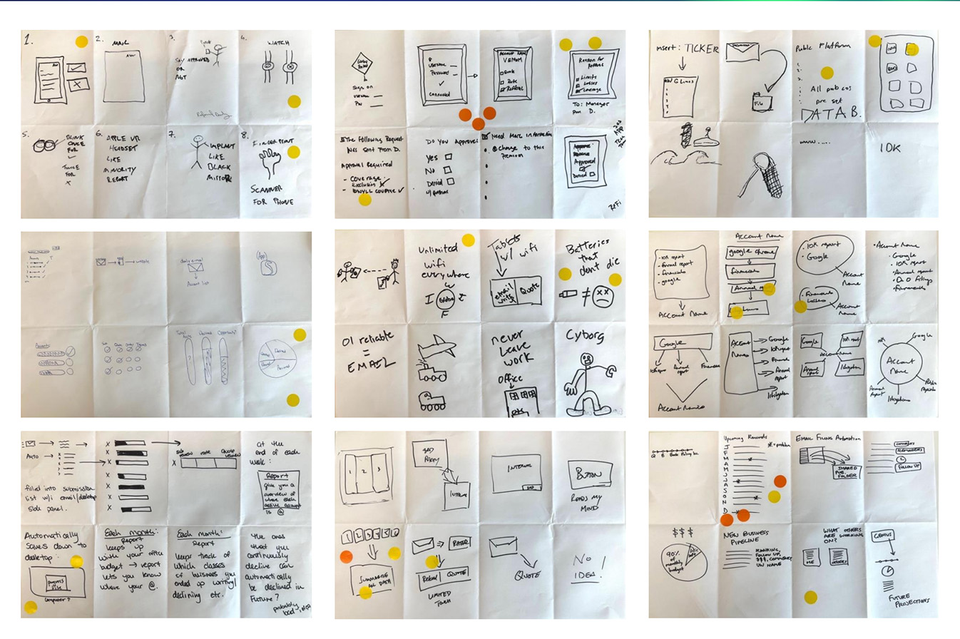
To kickstart idea generation, participants were given one of three prompts for Crazy Eights, my personal favorite Design Thinking activity. I get such a thrill out of making people draw within a time limit, especially people who say "I can't draw." The truth is that everyone can draw, they just need to be reassured that the quality of the drawing doesn't matter as long as it conveys an idea.
As you can see, people came up with some wild ideas as they panicked to jot things down. Even bad ideas (yes there is such a thing as a bad idea) like "Never leave the office in order to boost productivity" are valuable because they tell us something about the underwriters: that the business's most valuable asset is its people.
Shark Tank
Lastly, the participants refined their ideas in small groups. I like to run this activity like the show Shark Tank, bringing in external judges and giving out silly prizes. It brings out people's competive side and forces them to think about how to present their ideas in a thirty second "elevator pitch" format.

Design principles
We came away from the workshop with a good understanding of the underwriting process, along with our users' overarching needs and goals. We synthesized the information into a research readout for the client, which was crowned by these three principles to guide the next phase of design.
Persona
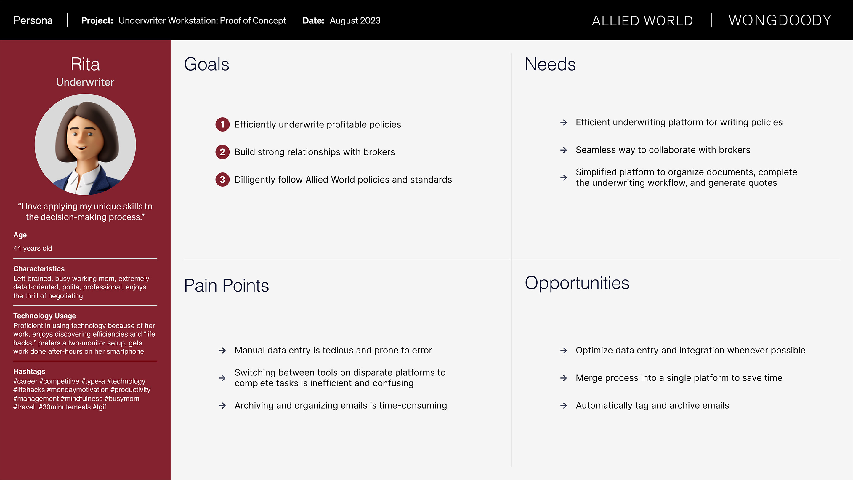
Part of the research readout was earning the trust and validation of our client stakeholders. Creating assets like this persona + empathy map helped our team confirm that we interpreted all the inputs correctly.

Platform flow
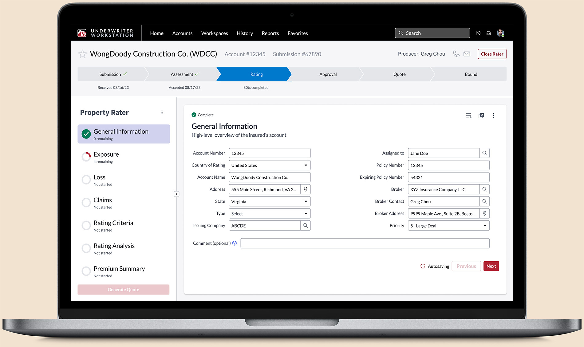
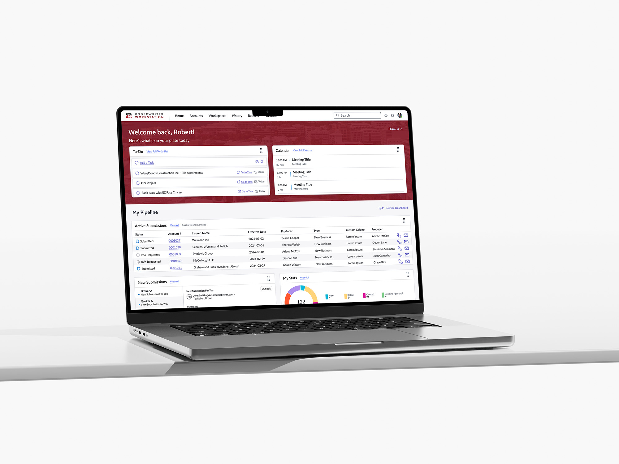
Unlike with most projects, we were able to skip the medium-fidelity wireframe stage because we were designing for the ServiceNow platform. This is partly due to the platform having specific constraints around how modules and data are displayed, and partly due to ServiceNow having a really robust Figma design library that saved us a ton of time.
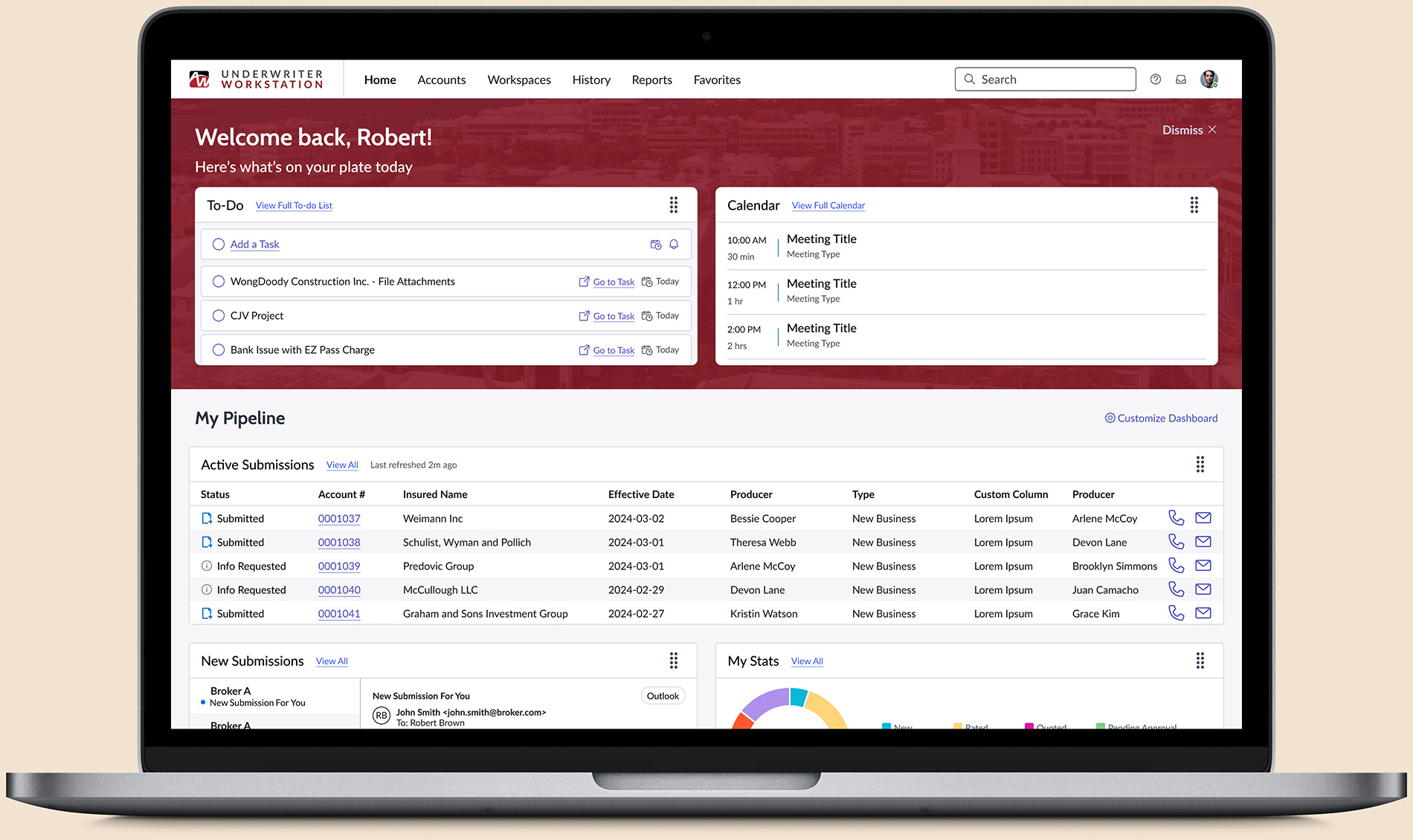
Data density was key here: With any platform aimed at professionals' everyday use, users expect to view and access a lot of data at once. With that in mind, we designed for optimal readability, using a minimal color palette and ample whitespace to maintain a visual hierarchy that's easy to digest.
Platform design
(Not real customer data)
Unlike with most projects, we were able to skip the medium-fidelity wireframe stage because we were designing for the ServiceNow platform. This is partly due to the platform having specific constraints around how modules and data are displayed, and partly due to ServiceNow having a really robust Figma design library that saved us a ton of time.
Data density was key here: With any platform aimed at professionals' everyday use, users expect to view and access a lot of data at once. With that in mind, we designed for optimal readability, using a minimal color palette and ample whitespace to maintain a visual hierarchy that's easy to digest.
Results
After several rounds of user testing prototypes with the underwriters, we landed on a platform design that was demonstrably more efficient than the current state while also providing customizable modules that flex to the needs of underwriters in varying lines of business. Even with the short turnaround and the constraints of ServiceNow, we found opportunities to surprise and delight with elements like the welcome banner that was personalized with images of the underwriter's local city. The users and client stakeholders alike were extremely happy with our designs,. Ultimately their dev team decided to pivot away from ServiceNow to a different ERP, but the concept images along with requirements documentation and roadmaps we provided gave them tools to start working on development right away.
Status
In development / developed
Credits
Agency: WongDoody
XD Team: Ruthie Edwards, Adam Fischbach, Gabriela Santiago, and Matt Chen

