Tools for the Insurance Planning Journey
Roles
UX design, service blueprints, concepts
Opportunity
Anthem has a decent member (end user) experience, but the broker experience has never been a priority. Like so many client projects I've been on, their tools are scattered among deprecated webpages and offline Excel spreadsheets. We knew that if Anthem could provide better tools to its brokers, who act as the liasons and friendly faces of the brand, they could beat competitors to the punch with plans that better serve their members' needs and make more sales.
Mapping the journey
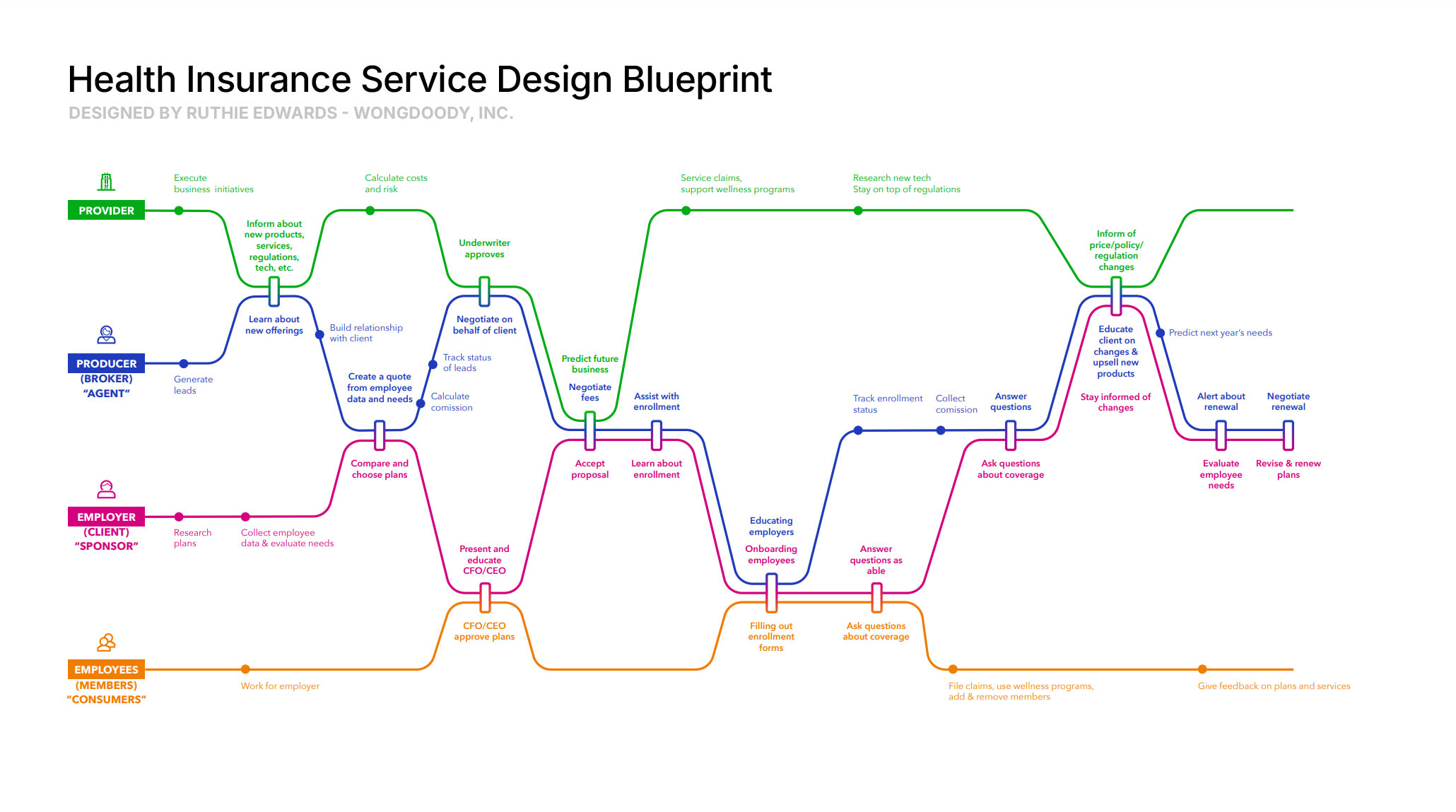
After our team interviewed HR leaders and brokers and did desk research, I started mapping out the service blueprint. As one might imagine, the process of buying insurance can't be represented by a single linear path because it's a cross-functional effort between 4 different actors: insurance providers, brokers, companies, and consumers.
We needed a diagram that was easily readable through a Zoom call, thus the "subway map" (as my coworkers call it) was born. Having designed some fantasy subway maps in my spare time, I created this diagram to highlight the many touchpoints between each actor in the journey. It looks simple but represents dozens of hours of boiling a complicated process down to the absolute minimum.
Warning! Ugly wireframes approaching
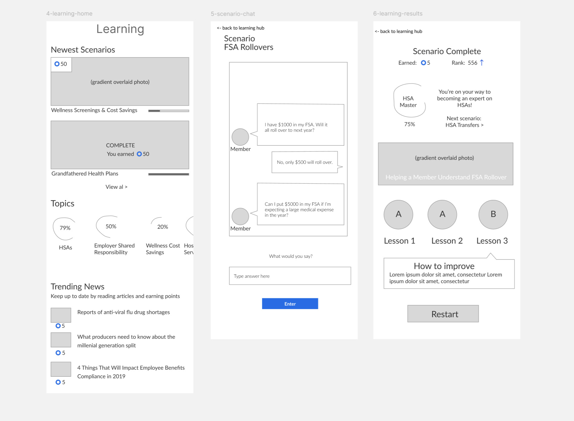
With a quick turnaround, we needed to work as fast as possible. Thus, many ugly wireframes were created. As I tell my students, the quality of your sketches doesn't matter as long as they communicate your ideas well. Sure, they make for terrible portfolio pieces, but that's not the point of making wireframes: it's to construct a layout and iterate on the design as quickly as possible.
In these three wireframes, I designed a learning dashboard for brokers to learn on the go. Since brokers spend a lot of time on the road, creating "snackable" training in the form of short modules and interactive scenarios was important.
Learning Center
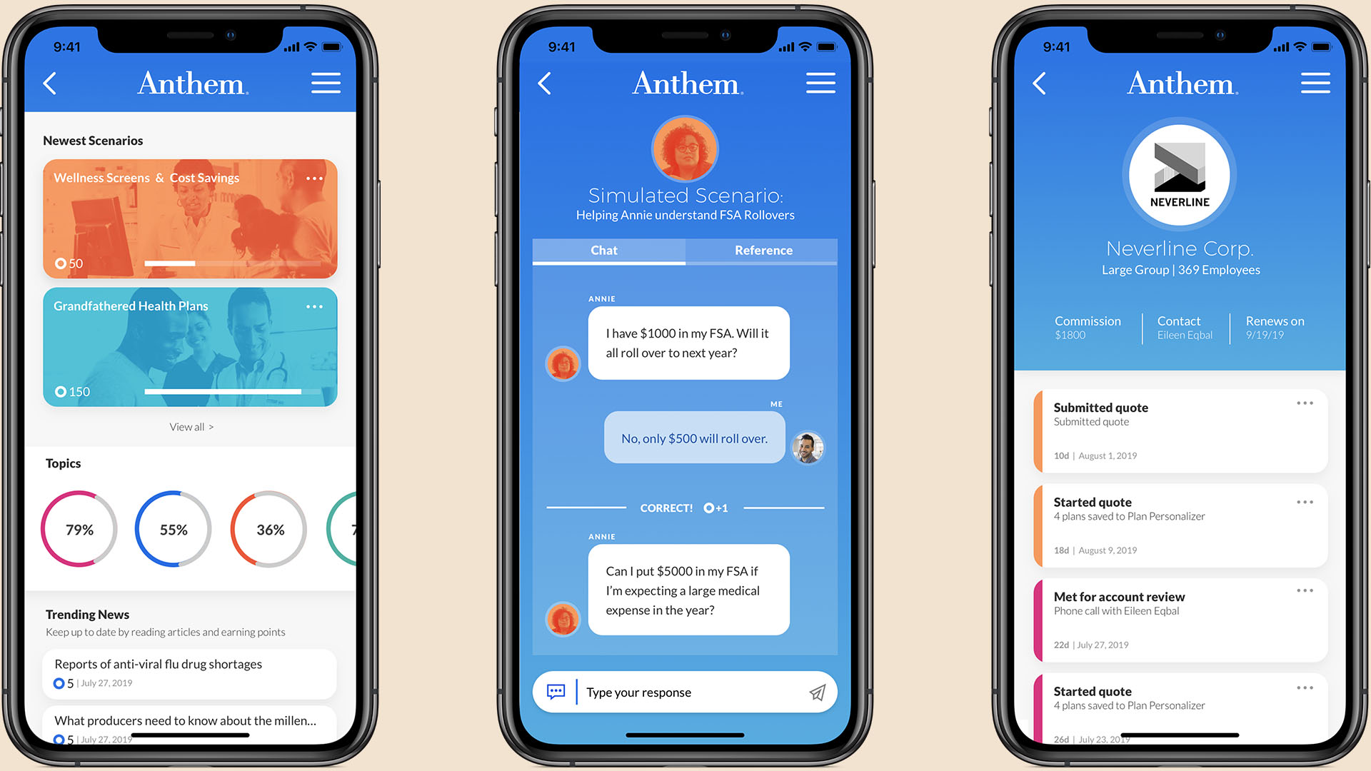
The learning center concept was really appealing to the client because of its quick hits of learning mixed with gamification elements like AI chat quizzes would keep brokers coming back for more.
Working in tandem with an art director, we brought the screens to life, plussing up Anthem's basic design styles with punchy gradients and blocks of their iconic blue color.
Benefit Planner
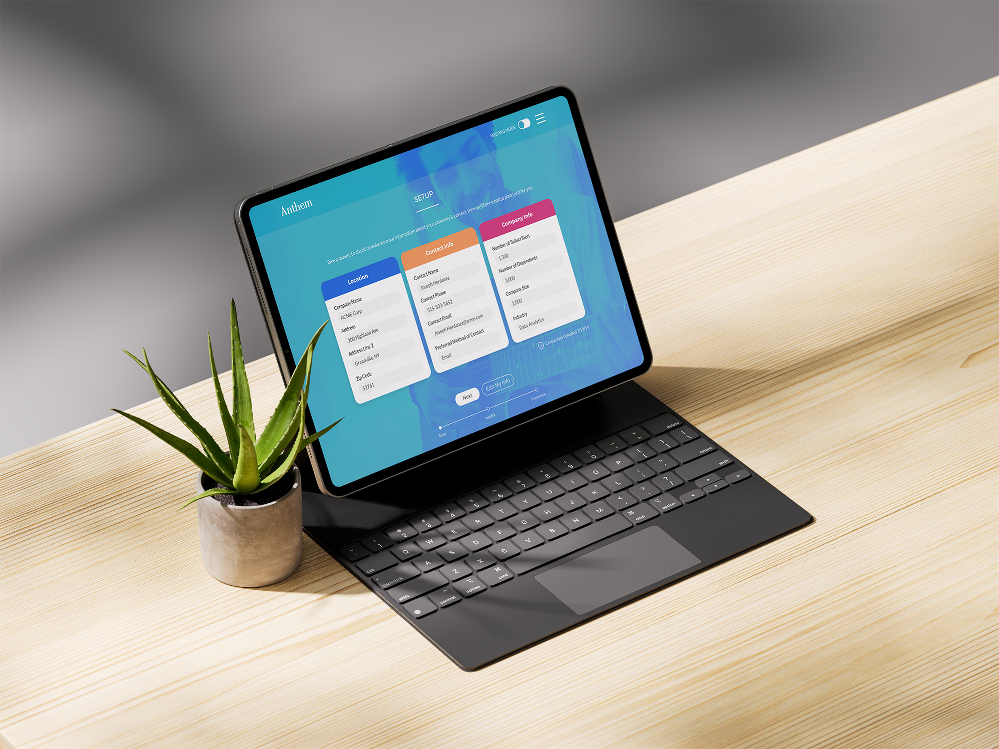
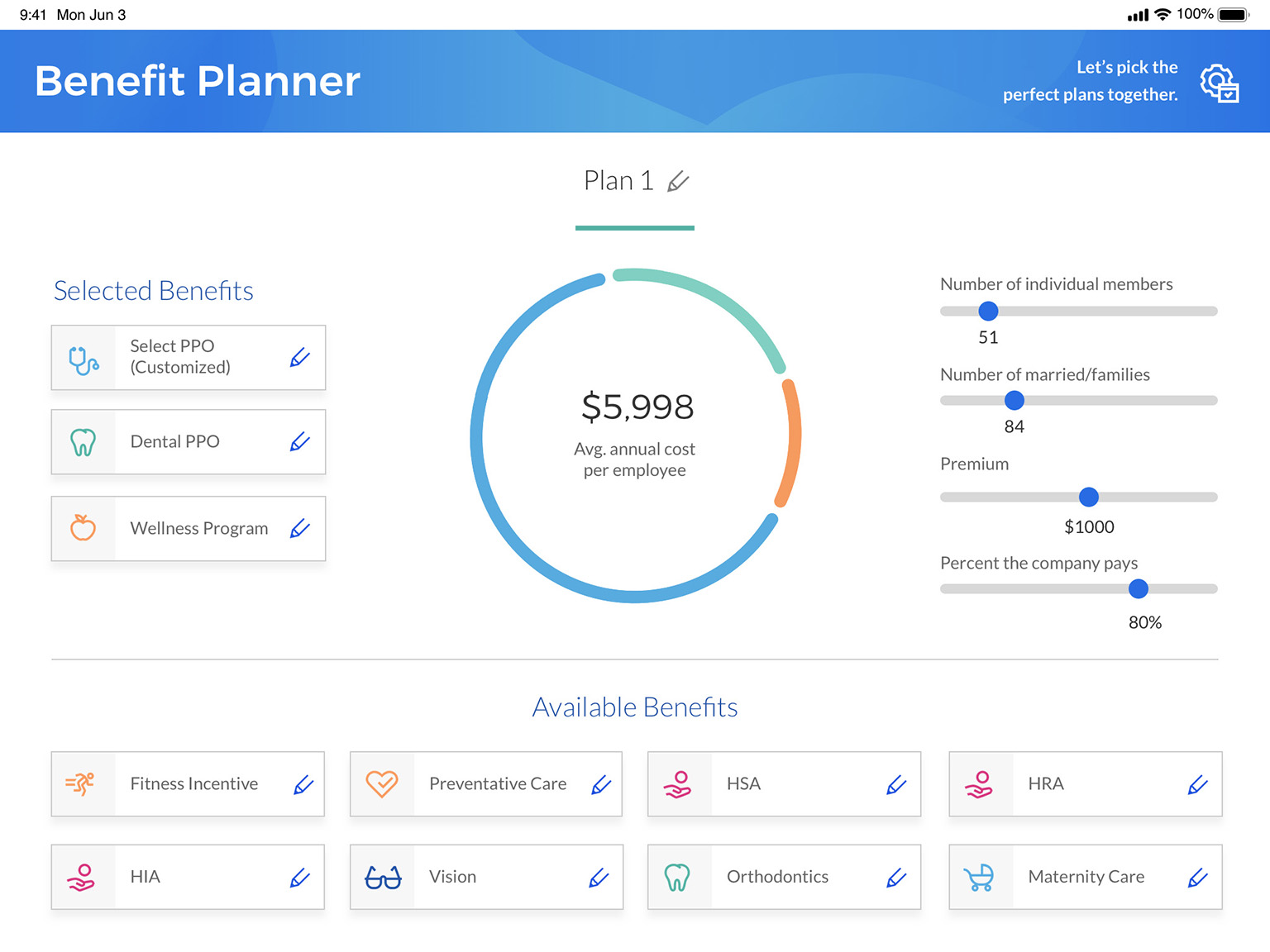
At the centerpiece of our recommendations was the Benefit Planner: a tool brokers could use with sponsors to personalize plans for their members. We designed the Benefit Planner in a tablet format to facilitate side-by-side meetings where both parties could easily tap to add and edit benefits to the plan.
Drag-and-drop benefits provide a clear cause and effect on the annual cost at the center of the planner, while elements like sliders are touch-friendly and encourage tinkering.

Sponsor Experience
Another important touchpoint between brokers and employers is the ongoing maintenance of plans. Besides winning new business, maintaining current clients is the most time-consuming part of brokers' work.
In this three step flow, brokers can edit the basic parameters of their client, view automatically generated insights that impact cost, and compare plans of different providers. A "Meeting Mode" button hides certain interface elements and internal data so brokers and their clients can work on the same tablet screen.
Extra credit
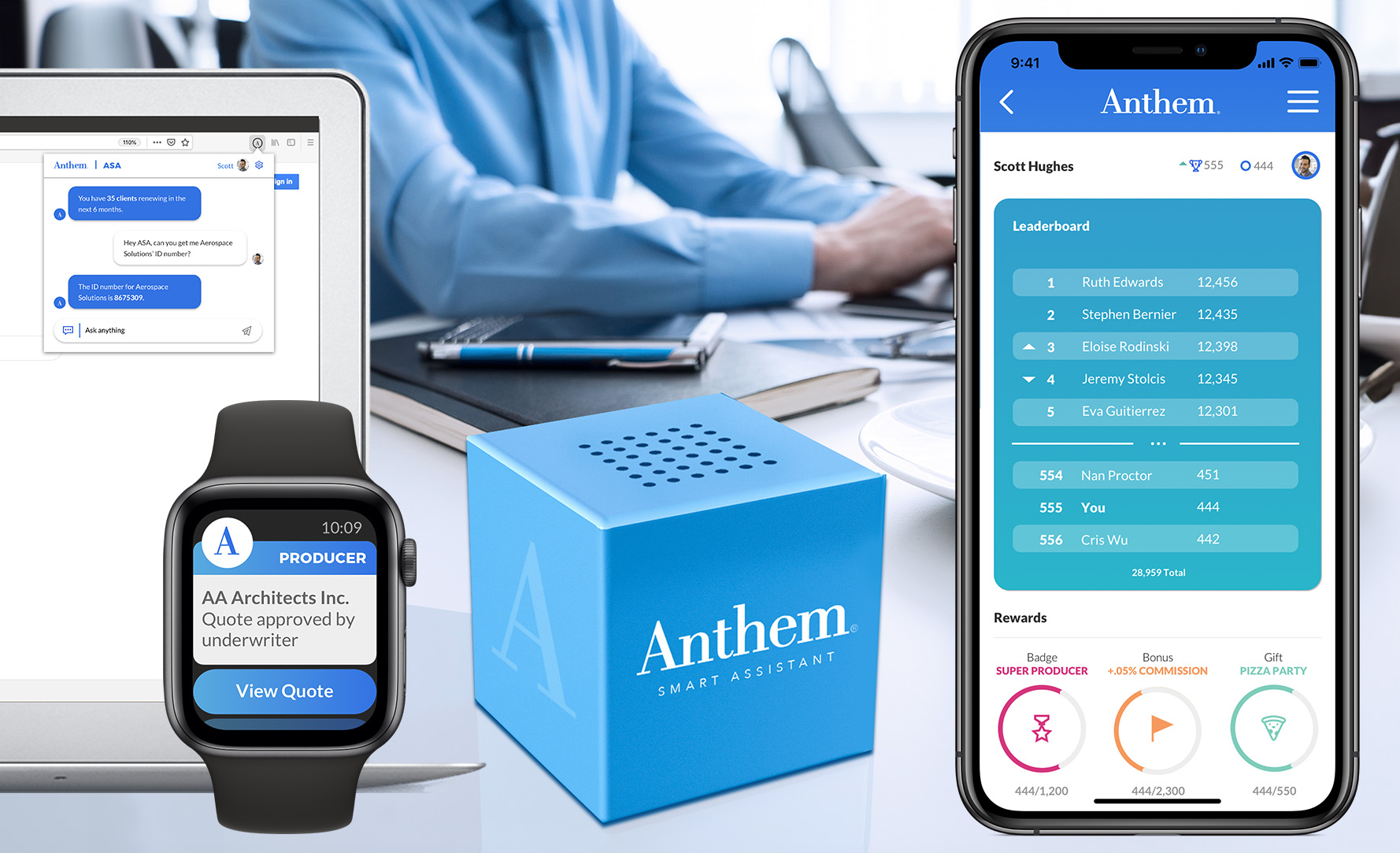
After two rounds of pitching, Anthem liked our ideas, but they wanted to see how far we could stretch our creative muscles. At this point our team pitched some kookier ideas like a browser plugin, Apple Watch app, gamification leaderboards, and even a hardware AI assistant. Admittedly Anthem is not a hardware company, but representing an AI assistant in this highly grok-able way made sense at the time we pitched it (before chatGPT existed).
Throughout the project we collaborated with our client SPOC to refine these ideas before pitching to the larger Anthem team. These types of pitches are always more satisfying than a cold pitch, because both sides benefit from the back-and-forth. As with any internal or B2B project, I enjoyed the inside peek on how the industry operates, and I appreciated the opportunity to push Anthem's corporate design scheme into some interesting places.
Status
Pitched to client
Credits
Agency: WongDoody
Strategy: Renee Quan-Knowles
Biz Dev: Michael Harper
Art Direction: Stephen Bernier
UX Director: Jess Wittebort
UX & Visual Design: Ruthie Edwards